Enron Email Network
Communication Graph
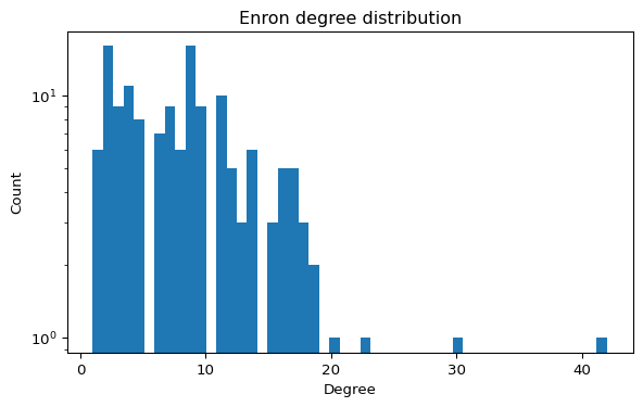
The Enron email dataset can be represented as a graph where nodes are email addresses and edges represent communication. It is widely used to study centrality, communities, and robustness.
Load the graph
import networkx as nx

G = nx.read_edgelist("data/ia-enron-only/ia-enron-only.edges")
Centrality metrics
Compute the top nodes by betweenness centrality.
import networkx as nx

bc = nx.betweenness_centrality(G)
# TODO: sort and print top 10 nodes
Hint: Top 10 by betweenness (click to expand)
bc = nx.betweenness_centrality(G)
top10 = sorted(bc.items(), key=lambda x: x[1], reverse=True)[:10]
print(top10)
Questions to explore
- Which nodes act as brokers in the network?
- How does the graph change if you remove high-betweenness nodes?
- Can you detect communities with a simple algorithm?