Given the data up to today, can you predict when the epidemic curve will peak? Castro, Ares, Cuesta and Manrubia argue that during the expansion phase you cannot: the time of the turning point cannot be determined with certainty before it is reached, there is only a short horizon for reliable prediction, and this persists even in error-free synthetic data (castro2020turning?). They reach this conclusion with an SIR model extended by confinement and a Bayesian fit to COVID-19 data from Spain. Here you reproduce the main effect with the plain SIR model.
Prediction
Before you run the experiment, write down how many days of data you think you need to predict the peak day within \(\pm 3\) days, for an epidemic that peaks around day 55.
Implementation
For each cut-off day \(T\):
take the first \(T\) days of the data;
fit \(\beta\), \(\gamma\), \(I(0)\) and \(N\) with fit_sir_incidence(..., fit_population=True);
simulate the fitted model forward and record the day of maximum incidence.
To see the spread caused by noise, repeat this for ten synthetic epidemics with the same true parameters and different noise seeds.
import matplotlib.pyplot as pltimport numpy as npfrom amlab.epidemics import fit_sir_incidence, sir_incidence, synthetic_sir_casesN =1e6horizon = np.arange(1, 301)true_peak = sir_incidence(horizon, 0.3, 0.1, 1e-5, N).argmax() +1cutoffs = [30, 40, 50, 60, 70]fig, ax = plt.subplots(figsize=(7, 4))for T in cutoffs: peaks = []for seed inrange(10): d, c = synthetic_sir_cases(seed=seed) f = fit_sir_incidence(d[:T], c[:T], population=N, fit_population=True) peaks.append(sir_incidence(horizon, f["beta"], f["gamma"], f["i0"], f["population"]).argmax() +1) ax.plot([T] *len(peaks), peaks, "o", color="tab:blue", alpha=0.6)print(f"T = {T}: predicted peaks from {min(peaks)} to {max(peaks)}")ax.axhline(true_peak, color="k", ls="--", label=f"true peak (day {true_peak})")ax.plot(cutoffs, cutoffs, ":", color="gray", label="today")ax.set_xlabel("Days of data used (T)")ax.set_ylabel("Predicted peak day")ax.legend()ax.grid(alpha=0.3)plt.tight_layout()plt.show()
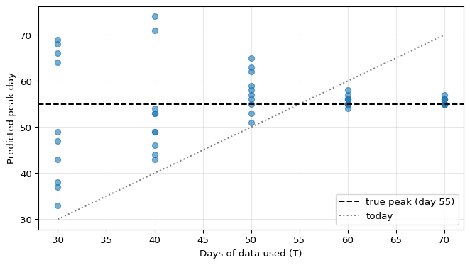
T = 30: predicted peaks from 33 to 69
T = 40: predicted peaks from 43 to 74
T = 50: predicted peaks from 51 to 65
T = 60: predicted peaks from 54 to 58
T = 70: predicted peaks from 55 to 57
Figure 1: Predicted peak day against the number of days of data used in the fit, for ten synthetic SIR epidemics (R0 = 3) with different noise. The dashed line is the true peak of the expected incidence.
Validation
After the peak (\(T = 60\) and \(T = 70\)) the predictions cluster around the true peak. This confirms that the fitting code works when the data contain enough information.
Interpretation
Before the peak, the predictions spread over several weeks, even though the model is exactly right and only the reporting noise differs. The reason is the identifiability problem from Fitting an Epidemic to Data: the rising part of the curve fixes \(\beta - \gamma\) but not \(R_0\) or \(N\), and the peak time depends on those. Castro et al. show that this sensitivity is a property of exponential growth, and conclude that forecasts should be given as probabilities of different outcomes, not as a single date (castro2020turning?).
Limitations
The model used for the fit is the model that generated the data. With real data the model is also wrong, which adds uncertainty.
Least squares with ten noise realizations is a rough substitute for a proper uncertainty analysis such as the Bayesian fit of (castro2020turning?).
Optional extension
If you have real incidence data, save them as data/epidemic/cases.csv (schema in data/epidemic/README.md) and repeat the experiment with a moving cut-off. Compare the predicted peaks with the observed one.
Two groups fit an SIR model to the first 30 days of an outbreak. Group A reports “\(R_0 = 2.9\), peak on day 57”. Group B reports “\(R_0\) between 2 and 200, peak between day 40 and day 70”. Which report is more useful, and why?
Answer
Group B’s report is more useful. With only early data, the fit determines the growth rate but not \(R_0\) or the peak time. A single number hides this uncertainty and invites decisions based on false precision. A range, or better a probability distribution, states honestly what the data support (castro2020turning?).
Source Code
---title: "Predicting the Peak"subtitle: "Module 1: Low-Dimensional Dynamics"format: html---Given the data up to today, can you predict when the epidemic curve will peak? Castro, Ares, Cuesta and Manrubia argue that during the expansion phase you cannot: the time of the turning point cannot be determined with certainty before it is reached, there is only a short horizon for reliable prediction, and this persists even in error-free synthetic data [@castro2020turning]. They reach this conclusion with an SIR model extended by confinement and a Bayesian fit to COVID-19 data from Spain. Here you reproduce the main effect with the plain SIR model.## PredictionBefore you run the experiment, write down how many days of data you think you need to predict the peak day within $\pm 3$ days, for an epidemic that peaks around day 55.## ImplementationFor each cut-off day $T$:- take the first $T$ days of the data;- fit $\beta$, $\gamma$, $I(0)$ and $N$ with `fit_sir_incidence(..., fit_population=True)`;- simulate the fitted model forward and record the day of maximum incidence.To see the spread caused by noise, repeat this for ten synthetic epidemics with the same true parameters and different noise seeds.```{python}#| label: fig-peak#| fig-cap: "Predicted peak day against the number of days of data used in the fit, for ten synthetic SIR epidemics (R0 = 3) with different noise. The dashed line is the true peak of the expected incidence."#| fig-width: 7#| fig-height: 4import matplotlib.pyplot as pltimport numpy as npfrom amlab.epidemics import fit_sir_incidence, sir_incidence, synthetic_sir_casesN =1e6horizon = np.arange(1, 301)true_peak = sir_incidence(horizon, 0.3, 0.1, 1e-5, N).argmax() +1cutoffs = [30, 40, 50, 60, 70]fig, ax = plt.subplots(figsize=(7, 4))for T in cutoffs: peaks = []for seed inrange(10): d, c = synthetic_sir_cases(seed=seed) f = fit_sir_incidence(d[:T], c[:T], population=N, fit_population=True) peaks.append(sir_incidence(horizon, f["beta"], f["gamma"], f["i0"], f["population"]).argmax() +1) ax.plot([T] *len(peaks), peaks, "o", color="tab:blue", alpha=0.6)print(f"T = {T}: predicted peaks from {min(peaks)} to {max(peaks)}")ax.axhline(true_peak, color="k", ls="--", label=f"true peak (day {true_peak})")ax.plot(cutoffs, cutoffs, ":", color="gray", label="today")ax.set_xlabel("Days of data used (T)")ax.set_ylabel("Predicted peak day")ax.legend()ax.grid(alpha=0.3)plt.tight_layout()plt.show()```## ValidationAfter the peak ($T = 60$ and $T = 70$) the predictions cluster around the true peak. This confirms that the fitting code works when the data contain enough information.## InterpretationBefore the peak, the predictions spread over several weeks, even though the model is exactly right and only the reporting noise differs. The reason is the identifiability problem from [Fitting an Epidemic to Data](fitting-epidemic-data.qmd): the rising part of the curve fixes $\beta - \gamma$ but not $R_0$ or $N$, and the peak time depends on those. Castro et al. show that this sensitivity is a property of exponential growth, and conclude that forecasts should be given as probabilities of different outcomes, not as a single date [@castro2020turning].## Limitations- The model used for the fit is the model that generated the data. With real data the model is also wrong, which adds uncertainty.- Least squares with ten noise realizations is a rough substitute for a proper uncertainty analysis such as the Bayesian fit of @castro2020turning.::: {.callout-tip}## Optional extensionIf you have real incidence data, save them as `data/epidemic/cases.csv` (schema in `data/epidemic/README.md`) and repeat the experiment with a moving cut-off. Compare the predicted peaks with the observed one.:::## NextSession 7 moves to two-dimensional systems.[Linear Systems in the Plane](linear-systems-2d.qmd){.btn .btn-primary}## Exit questionTwo groups fit an SIR model to the first 30 days of an outbreak. Group A reports "$R_0 = 2.9$, peak on day 57". Group B reports "$R_0$ between 2 and 200, peak between day 40 and day 70". Which report is more useful, and why?::: {.callout-tip collapse="true"}## AnswerGroup B's report is more useful. With only early data, the fit determines the growth rate but not $R_0$ or the peak time. A single number hides this uncertainty and invites decisions based on false precision. A range, or better a probability distribution, states honestly what the data support [@castro2020turning].:::