import matplotlib.pyplot as plt
import networkx as nx

G = nx.Graph()
G.add_node("Spain", population=47_000_000)
G.add_node("Portugal", population=10_000_000)
G.add_node("France", population=67_000_000)
G.add_node("Italy", population=60_000_000)
G.add_edge("Spain", "Portugal", distance=600)
G.add_edge("Spain", "France", distance=1000)
G.add_edge("France", "Italy", distance=800)
G.add_edge("USA", "Canada", distance=3000)
G.add_edge("Netherlands", "Germany", distance=500)
G.add_edge("Germany", "France", distance=900)
G.nodes["USA"]["population"] = 331_000_000
G.nodes["Canada"]["population"] = 38_000_000
G.nodes["Netherlands"]["population"] = 17_000_000
G.nodes["Germany"]["population"] = 83_000_000Drawing Attributes
Module 5: Complex Networks
Toolkit page
This page is self-study material for Session 23. It continues Drawing Graphs.
This page shows node and edge attributes in a drawing. The first chunk rebuilds the country graph.
Visualizing Attributes
Node Attributes
You can also visualize the attributes of nodes and edges by using different colors or sizes. For example, you can color the nodes based on their population attribute:
# Get the population attribute for each node
population = nx.get_node_attributes(G, 'population')
# Draw the graph with node sizes proportional to population
node_sizes = [population[node] / 1_000_000 for node in G.nodes()]  # scale down for visualization

pos = nx.circular_layout(G)

nx.draw(
    G,
    pos=pos,
    with_labels=True,
    node_color='lightblue',
    edge_color='gray',
    node_size=node_sizes,  # size of the nodes (vertices) proportional to population
    font_size=12,
    )
plt.show()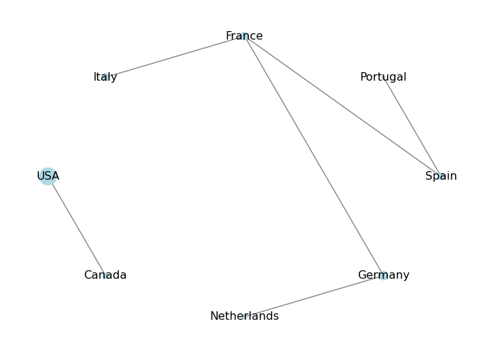
What happens if a node is missing an attribute?
In this case, the population dictionary will not have an entry for that node, and trying to access it will raise a KeyError. To avoid this, you can use the get() method of the dictionary, which lets you specify a default value if the key is not found. For example:
# Add a new node without the population attribute
G.add_edge("Denmark", "Germany", distance=400)
# Get the population attribute for each node, using 0 as default if not found
population = nx.get_node_attributes(G, 'population')
# Draw the graph with node sizes proportional to population
node_sizes = [population.get(node, 0) / 1_000_000 for node in G.nodes()]  # scale down for visualization

pos = nx.circular_layout(G)

nx.draw(
    G,
    pos=pos,
    with_labels=True,
    node_color='lightblue',
    edge_color='gray',
    node_size=node_sizes,  # size of the nodes (vertices) proportional to population
    font_size=12,
    )
plt.show()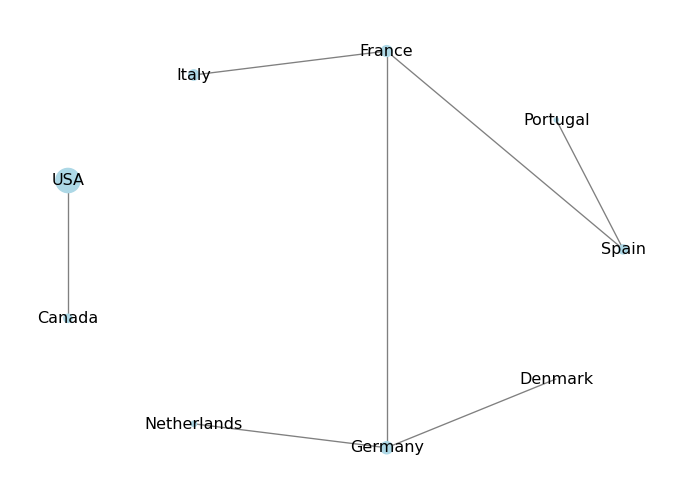
Exercise
Add a new attribute to the nodes, called “visited”, which is a boolean that indicates whether you have visited that country or not. Then, visualize the graph by coloring the nodes differently based on whether you have visited them or not: use blue for visited countries and red for unvisited countries.
G.nodes["Spain"]["visited"] = True
# TODO: set "visited" for the other countries

visited = nx.get_node_attributes(G, "visited")
node_colors = # TODO: one colour per node, "blue" if visited, else "red"
nx.draw(G, pos=nx.circular_layout(G), with_labels=True, node_color=node_colors)
plt.show()
Solution
Nodes without the attribute (here Netherlands, Germany and Denmark) count as not visited, thanks to visited.get(node, False).
# Add the "visited" attribute to the nodes
G.nodes["Spain"]["visited"] = True
G.nodes["Portugal"]["visited"] = True
G.nodes["France"]["visited"] = True
G.nodes["Italy"]["visited"] = True
G.nodes["USA"]["visited"] = False
G.nodes["Canada"]["visited"] = True

# Get the "visited" attribute for each node
visited = nx.get_node_attributes(G, 'visited')
# Define node colors based on the "visited" attribute
node_colors = ['blue' if visited.get(node, False) else 'red' for node in G.nodes()]

pos = nx.circular_layout(G)

# Draw the graph with node colors based on the "visited" attribute
nx.draw(
    G,
    pos=pos,
    with_labels=True,
    node_color=node_colors,  # color of the nodes based on "visited" attribute
    edge_color='gray',
    node_size=2000,
    font_size=12,
    )
plt.show()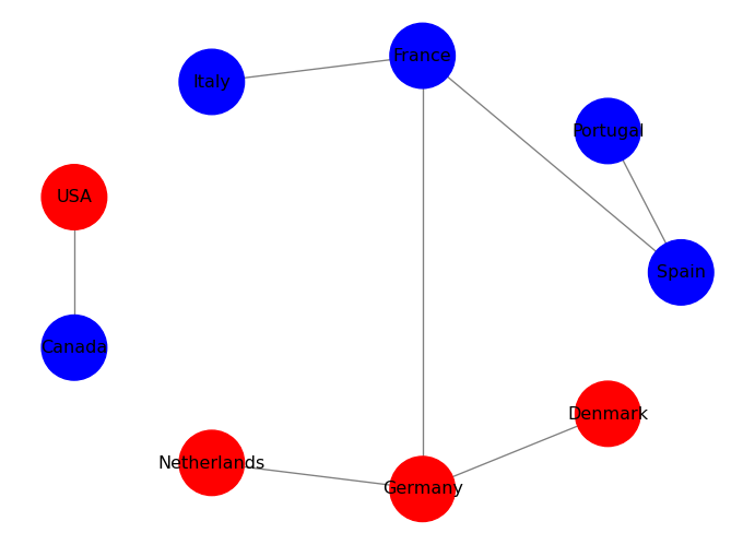
Edge Attributes
You can also visualize edge attributes by showing them as labels on the edges. For example, you can show the distance attribute on the edges:
# Get the distance attribute for each edge
distance = nx.get_edge_attributes(G, 'distance')
# Draw the graph
pos = nx.circular_layout(G)
nx.draw(
    G,
    pos=pos,
    with_labels=True,
    node_color='lightblue',
    edge_color='gray',
    node_size=2000,
    font_size=12,
    )
# Draw edge labels for the distance attribute
nx.draw_networkx_edge_labels(G, pos, edge_labels=distance)
plt.show()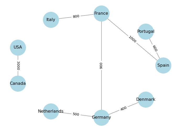
What’s Next?
The next page builds a graph from an edge list.