The Gaussian random walk model predicts normal log returns. On this page you test that prediction graphically and with the Jarque-Bera test. On the next page, Calibrated KS Test, you add a Kolmogorov-Smirnov test with a correctly computed p-value. You continue from Loading Prices and Computing Returns.
WARNING: data/finance/prices.csv not found. Using a SYNTHETIC GARCH(1,1) series with Student-t innovations (seed 2026). These are not market data. See data/finance/README.md.
Prediction
Exercise
If returns were normal, what fraction of days would have \(|z| > 4\)? Write the number down. Then count them in the data.
Solution
For a standard normal, \(\Pr(|Z| > 4) = 2\,\Pr(Z > 4) \approx 6 \times 10^{-5}\), about one day in 16 000. Real returns exceed this by a large factor.
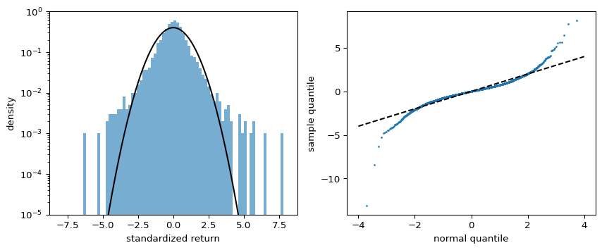
A histogram on a logarithmic density axis shows the tails. A quantile-quantile (Q-Q) plot shows the sorted standardized returns against the quantiles of the standard normal at probabilities \((i - 0.5)/n\). Normal data lie on the diagonal.
Figure 1: Left: histogram of standardized log returns with the standard normal density, on a log scale. Right: normal Q-Q plot. Points above the diagonal on the right and below it on the left indicate heavier tails than the normal.
The Jarque-Bera test
With sample skewness \(S\) and sample excess kurtosis \(K\), the Jarque-Bera statistic is
The test depends on the fourth moment. For heavy-tailed returns the sample kurtosis fluctuates wildly between samples (cont2001empirical?), so read \(K\) as “far from 0”, not as a precise number.
Interpretation so far
The Q-Q plot shows how the data depart from the normal, which a p-value does not. The Jarque-Bera test gives a p-value but relies on moments that may not exist for heavy tails. Next you build a test based on the whole distribution function: Calibrated KS Test.
Source Code
---title: "Normality Tests"subtitle: "Module 3: Modelling with Randomness"format: html---The Gaussian random walk model predicts normal log returns. On this page you test that prediction graphically and with the Jarque-Bera test. On the next page, [Calibrated KS Test](ks-bootstrap.qmd), you add a Kolmogorov-Smirnov test with a correctly computed p-value. You continue from [Loading Prices and Computing Returns](returns-data.qmd).```{python}import matplotlib.pyplot as pltimport numpy as npfrom scipy import statsfrom amlab.finance import load_prices, log_returnsr = log_returns(load_prices()["close"])z = (r - r.mean()) / r.std(ddof=1) # standardized returnsn = r.size```## Prediction::: {.callout-note}## ExerciseIf returns were normal, what fraction of days would have $|z| > 4$? Write the number down. Then count them in the data.:::::: {.callout-tip collapse="true"}## SolutionFor a standard normal, $\Pr(|Z| > 4) = 2\,\Pr(Z > 4) \approx 6 \times 10^{-5}$, about one day in 16 000. Real returns exceed this by a large factor.```{python}print(f"normal prediction: {2* stats.norm.sf(4):.1e}")print(f"observed: {np.mean(np.abs(z) >4):.1e}")```:::## Graphical checks: histogram and Q-Q plotA histogram on a logarithmic density axis shows the tails. A quantile-quantile (Q-Q) plot shows the sorted standardized returns against the quantiles of the standard normal at probabilities $(i - 0.5)/n$. Normal data lie on the diagonal.```{python}#| label: fig-lab-hist-qq#| fig-cap: "Left: histogram of standardized log returns with the standard normal density, on a log scale. Right: normal Q-Q plot. Points above the diagonal on the right and below it on the left indicate heavier tails than the normal."fig, axes = plt.subplots(1, 2, figsize=(9, 3.8))grid = np.linspace(-8, 8, 400)axes[0].hist(z, bins=80, range=(-8, 8), density=True, alpha=0.6)axes[0].semilogy(grid, stats.norm.pdf(grid), "k-")axes[0].set_ylim(1e-5, 1)axes[0].set_xlabel("standardized return")axes[0].set_ylabel("density")theoretical = stats.norm.ppf((np.arange(1, n +1) -0.5) / n)axes[1].plot(theoretical, np.sort(z), ".", ms=2)axes[1].plot([-4, 4], [-4, 4], "k--")axes[1].set_xlabel("normal quantile")axes[1].set_ylabel("sample quantile")plt.tight_layout()plt.show()```## The Jarque-Bera testWith sample skewness $S$ and sample excess kurtosis $K$, the Jarque-Bera statistic is$$JB = \frac{n}{6} \left( S^2 + \frac{K^2}{4} \right),$$which is asymptotically $\chi^2$ with 2 degrees of freedom under normality [@jarque1980efficient].```{python}jb = stats.jarque_bera(r)print(f"skewness {stats.skew(r):.2f}, excess kurtosis {stats.kurtosis(r):.2f}")print(f"JB = {jb.statistic:.1f}, p-value = {jb.pvalue:.2e}")```The test depends on the fourth moment. For heavy-tailed returns the sample kurtosis fluctuates wildly between samples [@cont2001empirical], so read $K$ as "far from 0", not as a precise number.## Interpretation so farThe Q-Q plot shows *how* the data depart from the normal, which a p-value does not. The Jarque-Bera test gives a p-value but relies on moments that may not exist for heavy tails. Next you build a test based on the whole distribution function: [Calibrated KS Test](ks-bootstrap.qmd).